Rage Clicks Analysis & UX Improvements
Rage Clicks Analysis & UX Improvements
At IKEA, I led a 3 month UX research to reduce rage clicks by analyzing user behavior with Microsoft Clarity. This project focused on improving website usability by identifying common pain points and implementing targeted design enhancements.
Rage click events were unusually high in key funnel pages, especially on product detail and cart pages. These interactions indicated user frustration and potential usability issues. My goal was to investigate where and why these rage clicks happened and deliver actionable insights to reduce them.
Led to a 24.3% drop in rage clicks on product and cart pages after targeted UI changes
Led to a 24.3% drop in rage clicks on product and cart pages after targeted UI changes
Led to a 24.3% drop in rage clicks on product and cart pages after targeted UI changes
Due to limited access to advanced analytics tools at the time (we only used Microsoft Clarity), I adopted a manual approach to analyze rage click behavior.
Due to limited access to advanced analytics tools at the time (we only used Microsoft Clarity), I adopted a manual approach to analyze rage click behavior.

Sampling Strategy
I created a sample from session recordings, focusing on the most used browsers and platforms. Because Android devices (mostly mobile) and Google Chrome showed higher rage click rates, they were more heavily represented in the sample to provide deeper insight.
I created a sample from session recordings, focusing on the most used browsers and platforms. Because Android devices (mostly mobile) and Google Chrome showed higher rage click rates, they were more heavily represented in the sample to provide deeper insight.
Session Review
Over 3 months, I manually reviewed rage click sessions using Microsoft Clarity (focusing only on the rage click moments). I focused only on product detail and cart pages, since rage click rates were highest there.
Over 3 months, I manually reviewed rage click sessions using Microsoft Clarity (focusing only on the rage click moments). I focused only on product detail and cart pages, since rage click rates were highest there.
Data Collection
Each rage click session was logged in an Excel table with the Page URL, Page Type, Browser, Device (mobile or desktop) and short summary of user behavior and suspected cause. I used same summary for same causes to make summarizing outcome easily.
Each rage click session was logged in an Excel table with the Page URL, Page Type, Browser, Device (mobile or desktop) and short summary of user behavior and suspected cause. I used same summary for same causes to make summarizing outcome easily.
Data Organization & Reporting
I grouped repeated patterns and calculated rage click frequencies by device type and browser. At the end of the analysis, I created summary tables and simple charts to prioritize implementation of common caused.
I grouped repeated patterns and calculated rage click frequencies by device type and browser. At the end of the analysis, I created summary tables and simple charts to prioritize implementation of common caused.
Key Findings
Key Findings
Key Findings
*Due to NDA with my employer, all findings and data are confidential and can't be shared publicly.
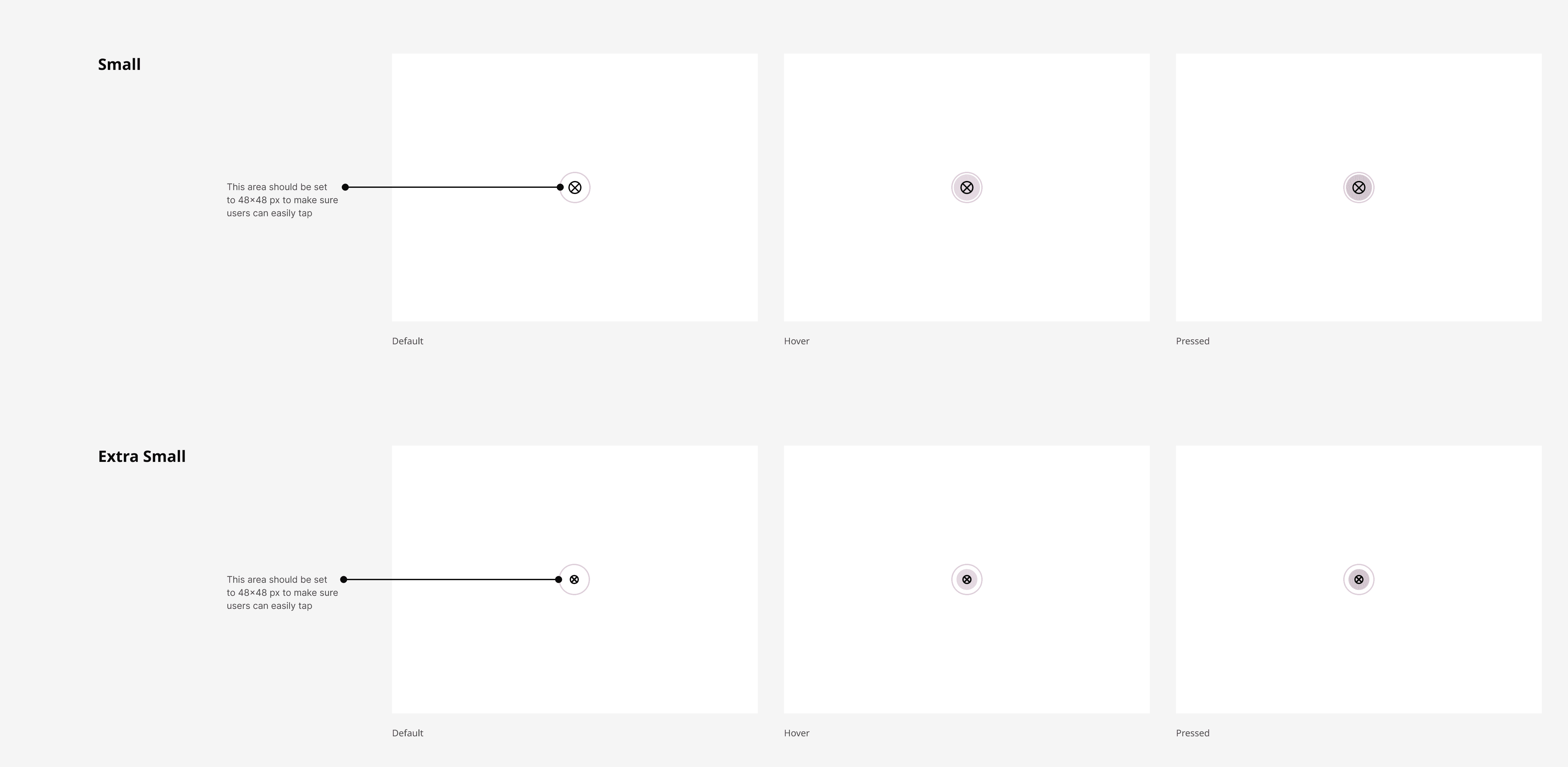
Poor tap target
After clicking “Add to Cart,” a confirmation pop-up appeared with a close (X) icon. On mobile devices, the tap area was too small (5% poor click target in desktop as well). Users tried to close it multiple times, triggering rage clicks.
After clicking “Add to Cart,” a confirmation pop-up appeared with a close (X) icon. On mobile devices, the tap area was too small (5% poor click target in desktop as well). Users tried to close it multiple times, triggering rage clicks.
Misleading hover state
The product color label had an underline on hover (especially in Chrome), making it look clickable. Users repeatedly clicked it expecting to change color, which was not supported.
The product color label had an underline on hover (especially in Chrome), making it look clickable. Users repeatedly clicked it expecting to change color, which was not supported.
Images are not interactive
Users attempted to click the product image to view more details, expecting it to behave like a link to the product page. Since it wasn’t clickable, it caused repeated clicking behavior.
Users attempted to click the product image to view more details, expecting it to behave like a link to the product page. Since it wasn’t clickable, it caused repeated clicking behavior.
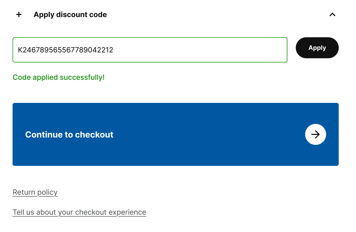
Promo code input unclear
Some users tried to enter promo codes but there was no clear feedback after entering a code. This lack of visual confirmation led users to click the "Apply" button multiple times.
Some users tried to enter promo codes but there was no clear feedback after entering a code. This lack of visual confirmation led users to click the "Apply" button multiple times.
Quantity stepper issues
When users tried to change the product quantity using the stepper component, the entire page re-rendered, causing a noticeable delay before the updated value appeared. As there was no immediate visual feedback, users repeatedly tapped the stepper buttons, thinking their action hadn't been registered.
When users tried to change the product quantity using the stepper component, the entire page re-rendered, causing a noticeable delay before the updated value appeared. As there was no immediate visual feedback, users repeatedly tapped the stepper buttons, thinking their action hadn't been registered.
Challenges & Key Decisions
Challenges & Key Decisions
Challenges & Key Decisions
One of the main challenges was designing a compact, single page request form that could handle complex inputs without overwhelming users. Since users were expected to submit multiple product requests in one session, the layout needed to be clean, fast to complete, and easy to scan.
One of the main challenges was designing a compact, single page request form that could handle complex inputs without overwhelming users. Since users were expected to submit multiple product requests in one session, the layout needed to be clean, fast to complete, and easy to scan.
The top section (Requested For, Category, Supplier) was previously hard to notice. I redesigned it with clearer visual hierarchy so users could understand they needed to take action.
The top section (Requested For, Category, Supplier) was previously hard to notice. I redesigned it with clearer visual hierarchy so users could understand they needed to take action.
Input fields were resized for better readability and accessibility. Labels were made more legible, and placeholders were written to guide user input more effectively.
Input fields were resized for better readability and accessibility. Labels were made more legible, and placeholders were written to guide user input more effectively.
Related fields like “Quantity” and “Unit” were merged into a single line to reduce cognitive load.
Related fields like “Quantity” and “Unit” were merged into a single line to reduce cognitive load.
Inputs like Quantity, Price, and Recurring (which don’t require long entries) were grouped on the same row to save space.
Inputs like Quantity, Price, and Recurring (which don’t require long entries) were grouped on the same row to save space.
The second form page, which was only relevant to advanced users, was turned into a collapsible section. It now appears closed by default and can be expanded if needed—removing the need for multiple pages.
The second form page, which was only relevant to advanced users, was turned into a collapsible section. It now appears closed by default and can be expanded if needed—removing the need for multiple pages.
The order summary module was made sticky during scroll, so users can easily review their total without navigating back to the top.
The order summary module was made sticky during scroll, so users can easily review their total without navigating back to the top.
A “Back to Top” button was added to improve navigation in long product lists.
A “Back to Top” button was added to improve navigation in long product lists.
Outcome
Outcome
Outcome
I delivered a prioritized list of UI/UX issues based on rage click frequency and severity. These insights were shared with the product and development teams. Several minor UI improvements were implemented, such as:
I delivered a prioritized list of UI/UX issues based on rage click frequency and severity. These insights were shared with the product and development teams. Several minor UI improvements were implemented, such as:
Making tappable areas larger for mobile (Min. 48x48).
Making tappable areas larger for mobile (Min. 48x48).
Removing underlines from non-clickable elements.
Removing underlines from non-clickable elements.
Linking product images in the cart back to product detail page.
Linking product images in the cart back to product detail page.
Added a success message below the discount code input field to provide feedback and reduce unnecessary interactions.
Added a success message below the discount code input field to provide feedback and reduce unnecessary interactions.
A developer ticket was created in Trello to fix the rendering behavior so the quantity updates without reloading the page.
A developer ticket was created in Trello to fix the rendering behavior so the quantity updates without reloading the page.